
 -by
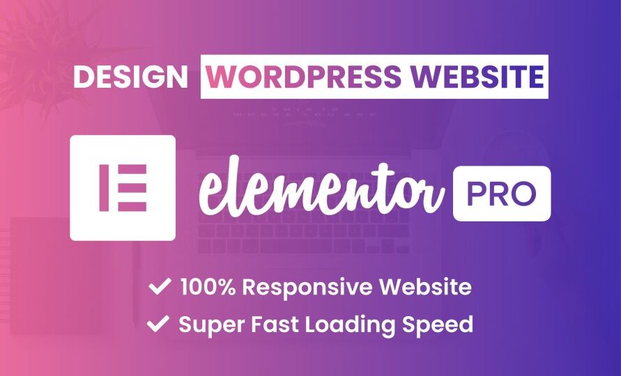
-by In today’s digital landscape, having a responsive website design is crucial to providing a seamless user experience across various devices. With the increasing use of smartphones, tablets, and other gadgets, ensuring that your website looks and functions well on all screen sizes is no longer a luxury but a necessity. WordPress, one of the most popular content management systems, offers a powerful tool called Elementor that empowers you to craft stunning and responsive website designs that cater to all devices.
Contact with Elementor professional designer
Understanding Responsive Design
Responsive design refers to the approach of designing and developing websites that automatically adjust and adapt to different screen sizes and orientations. This means that your website should look and function perfectly whether it’s accessed on a large desktop monitor, a laptop, a tablet, or a smartphone. A responsive website ensures that users can easily navigate, read content, and interact with your site without having to zoom in or scroll excessively.
Enter Elementor: A Game-Changer for WordPress
Elementor is a robust page builder plugin for WordPress that has gained immense popularity for its user-friendly interface and powerful features. It empowers both beginners and experienced developers to create visually appealing and highly functional websites without needing to write a single line of code. One of Elementor’s standout features is its seamless integration with responsive design principles, making it an ideal choice for crafting websites that shine on any device.
Key Features of Elementor for Responsive Website Design
1. Mobile Editing: Elementor allows you to preview and edit your website design in real-time across different device views. This means you can see exactly how your changes will appear on desktops, tablets, and smartphones, enabling you to make adjustments that ensure a consistent and pleasant user experience.
2. Responsive Widgets: Elementor offers a wide range of widgets (pre-designed elements) that are responsive by default. These widgets automatically adapt to various screen sizes, ensuring that your content, images, and interactive elements remain visually appealing and user-friendly on any device.
3. Custom Breakpoints: Elementor enables you to set custom breakpoints, which are specific screen sizes where your design layout may need to change. This level of control ensures that your website looks polished and functions optimally across a variety of devices, from small smartphone screens to large desktop displays.
4. Flexbox and CSS Grid Support: To achieve complex layouts that respond well to different devices, Elementor supports both Flexbox and CSS Grid layouts. These advanced layout techniques ensure that your content is organized elegantly while maintaining responsiveness.
5. Performance Optimization: A responsive website doesn’t just look good; it also needs to load quickly. Elementor’s optimization features help you maintain a balance between aesthetics and performance, ensuring that your website loads swiftly on all devices.
Best Practices for Responsive Design with Elementor
1. Simplify Navigation: On smaller screens, navigation menus can become overwhelming. Use Elementor’s navigation widget to create a user-friendly and collapsible menu that enhances mobile navigation.
2. Prioritize Content: Content hierarchy becomes crucial in responsive design. With Elementor, you can easily rearrange content elements to prioritize the most important information, ensuring a smooth reading experience on all devices.
3. Optimize Images: Large images can slow down your website’s loading time. Elementor allows you to set different image sizes and resolutions for various devices, so you can provide high-quality visuals without sacrificing performance.
4. Test Thoroughly: Elementor’s live preview feature lets you see how your design changes impact different devices in real-time. However, don’t forget to test your website on actual devices to catch any potential issues.
Find Elementor professional designer
Conclusion
In a world where online interactions happen across a multitude of devices, responsive design is no longer an option but a requirement. WordPress Elementor emerges as a powerful solution to create website designs that seamlessly adapt to various screen sizes and orientations. By utilizing Elementor’s intuitive features, responsive widgets, and customization options, you can craft visually appealing and functional websites that captivate users across desktops, tablets, and smartphones. Stay ahead in the digital game by embracing responsive design with Elementor, and deliver exceptional user experiences on every device.