
 -by
-by In today’s digital age, a visually appealing and responsive website design is essential for establishing a strong online presence for your brand or blog. WordPress, the world’s most popular content management system, offers an array of tools and resources that empower you to create a captivating website that not only resonates with your target audience but also adapts seamlessly to various devices. In this article, we’ll explore the key steps to create a responsive WordPress website design that effectively showcases your brand or blog.
1. Choose the Right Theme
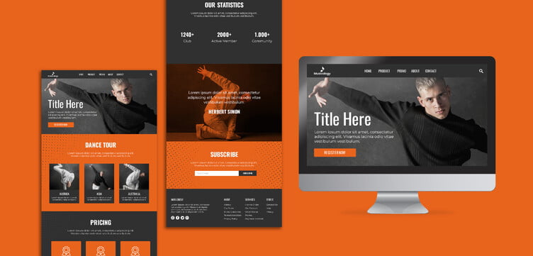
Selecting an appropriate theme is the foundation of your website’s design. Opt for a responsive WordPress theme that aligns with your brand’s personality and values. Themes like Astra, Divi, or OceanWP are known for their responsiveness and customization options. These themes ensure that your website looks stunning on desktops, tablets, and smartphones, enhancing user experience and SEO ranking.
2. Prioritize Mobile-Friendly Design
With an increasing number of users accessing websites via mobile devices, mobile-friendliness is crucial. Your chosen theme should automatically adjust elements like font size, images, and layout to fit smaller screens. Preview your site on various devices during the design process to ensure a seamless mobile experience.
3. Optimize Images for Web
High-resolution images are visually appealing, but they can slow down your website’s loading speed. Use image optimization plugins like Smush or ShortPixel to compress and resize images without compromising quality. Faster loading times not only enhance user engagement but also positively impact your website’s search engine rankings.
4. Implement a Clean and Intuitive Layout
A cluttered and confusing layout can drive visitors away. Embrace a clean and intuitive design that highlights your most important content. Use whitespace effectively, create clear navigation menus, and strategically place call-to-action buttons to guide users through your website.
5. Utilize Responsive Plugins
WordPress offers a plethora of plugins that can enhance the responsiveness of your website. Plugins like WPtouch or Jetpack’s Mobile Theme ensure that your website is optimized for touch interactions and mobile users, ultimately boosting user engagement and SEO performance.
6. Focus on Readability and Typography
Readable content is at the core of user engagement. Choose fonts that are easy on the eyes and maintain consistency throughout your website. Pay attention to font sizes, line spacing, and contrast to enhance readability across different devices.
7. Test Across Multiple Devices
Before launching your website, thoroughly test it across various devices and browsers. This step helps you identify any design inconsistencies or responsiveness issues that might arise. Ensuring a flawless user experience on different platforms is key to retaining visitors and reducing bounce rates.
8. Stay Updated
WordPress regularly releases updates to enhance functionality and security. Keep your theme, plugins, and WordPress version up to date to ensure a seamless and responsive website design. Updated software not only improves user experience but also safeguards your website against security vulnerabilities.
9. Optimize for Speed
Page loading speed is a critical factor for both user satisfaction and SEO ranking. Utilize caching plugins like W3 Total Cache or WP Super Cache to improve loading times. Compressed files, browser caching, and minimized scripts contribute to a faster website, which in turn leads to better search engine visibility.
Conclusion
In the digital landscape, a responsive WordPress website design is pivotal for effectively presenting your brand or blog to the world. By carefully selecting the right theme, optimizing images, and ensuring mobile-friendliness, you’ll create a visually appealing and user-friendly online platform. Prioritizing readability, layout, and speed will not only engage your audience but also improve your website’s SEO performance. With these steps, you’ll be well on your way to crafting a captivating and responsive WordPress website design that truly represents your brand or blog’s identity.